Spatio-temporal and Events Based Analysis of COVID-19 in Twitter

Social media platforms are increasingly being used for the analysis of human behavior. Twitter is a great platform for users to share comments and update their status. The COVID-19 pandemic is a prime example of this; there were more than 628 million COVID-19 related tweets at the time of writing the document.
In this project, we will analyze the tweet data in the US continent from September 10th to October 9th spatially and temporally to find out how the public reacts to the COVID-19 pandemic on Twitter.
Twitter Data Mining
There are several methods to grab data from Twitter. The first method is to use the python library Tweepy to extract tweets. The second method is to use the software Hydrator to extract tweets from the tweet IDs from the dataset in the COVID-19 research. In this project, we tried the second method. We intergrated the data in hours into the data in days from Chen, etc.'s dataset. The benefits of Hydrator are: first, it can automatically start and pause the procedure. It can solve the problem of the rate limit for twitter APIs. Second, the result would be more convincing. Unlike the first method to extract tweets by limited keywords, chen etc incrementally added keywords based on the conversations occurring on Twitter at any time. The keywords they used include not only “COVID”, but also the relevant words, like “stay at home”, “GetMePPE”, “Chinese Virus” (This is wrong, but the word could be seen a lot on Twitter) etc.
Spatial and Temporal Analysis
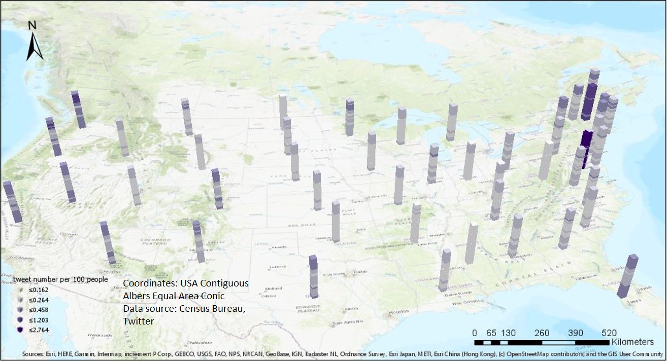
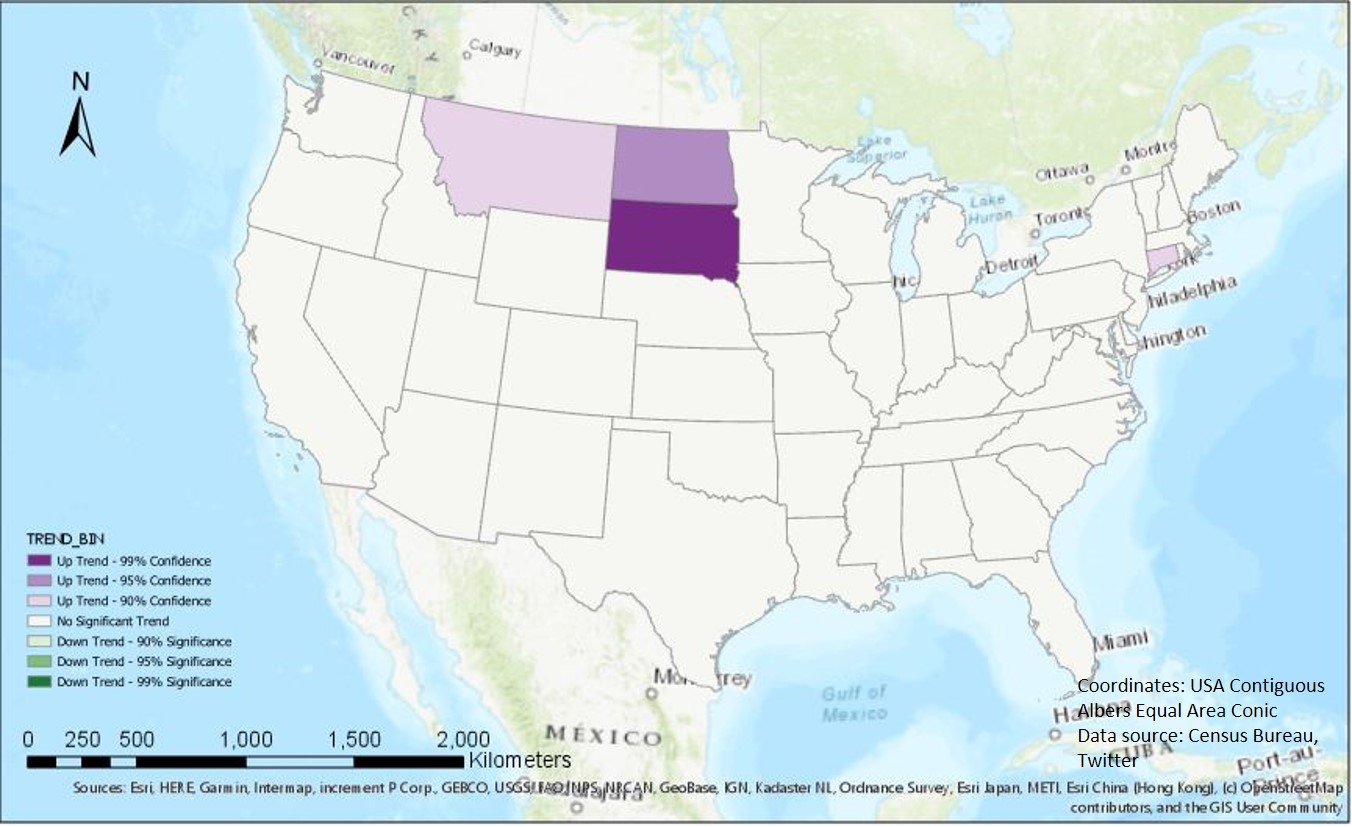
In this project, we focus on the the tweet number. For different scales, we have different strategies. On the state scale, we normalize the data by the population in each state. At first, we calculate the global Moran's I. The unit is the state, while the value is the tweet counts per 100 people. The global Moran's I is -0.16 and z-score is -2.05. It indicates there is no significant pattern on the state scale. we, then, create a space time cube to see how the tweet density vary spatially and temporally. The time interval of each cube is 1 day. From Figure 3, we can see east coast region has the high density and there are more tweets per day in October than in September. Next, we perform the Mann-Kendall trend test. Figure 4 shows South Dakota, North Dakota, Connecticut, and Montana have up trends. But only the result of North Dakota is statistically significant.
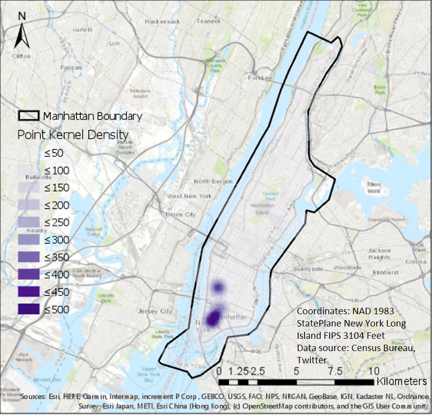
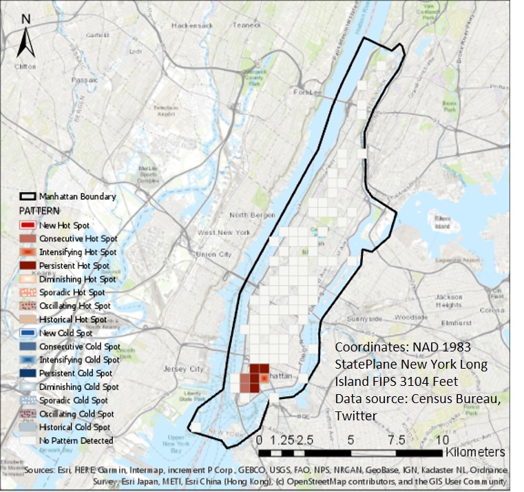
As for data with coordinate information, we choose one county which holds the most tweets in 30 days -- Manhattan for analysis. First, we create a kernel point density map first. Figure 5 shows there are clustered tweets around SOHO and Greenwich village. Then, we perform emerging hot spot analysis (Figure 6), and also find that around SOHO, there exist consecutive hot spots and persistent hot spots. We sample some tweets and find that most of them are the tweets from restaurants and shops for COVID policy.
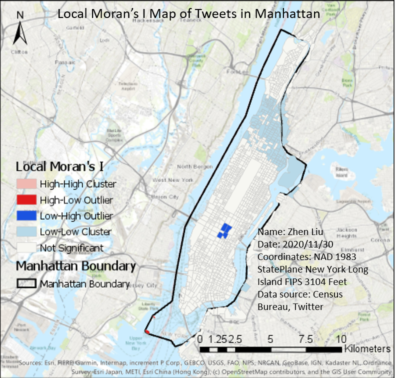
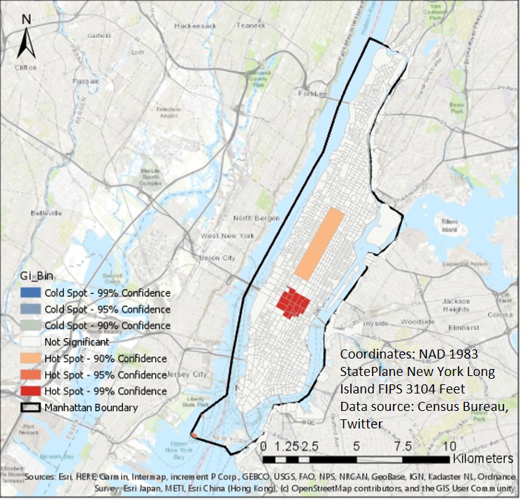
To make the result more convincing, we tried to normalize the tweet counts by the blockgroup population and perform Local Moran's I analysis, Hot spot analysis, Optimized hot spot analysis, and Optimized outlier analysis. For hot spot analysis and optimized outlier analysis, there is no significant result. But From Figure 7 (local moran's I analysis) and Figure 8 (optimized hot spot analysis), we can see Northern Manhattan don't tweet too much about COVID-19 and share their coordinates. And, in the Central park and Time square, the COVID-19 tweet density is high. In the sample tweets, most of them are from tourists. (like "Covid dining in NYC") Those maybe the reasons that the hot spots occur. (For the central park, we use the average number of tourist per day as population).
Further research
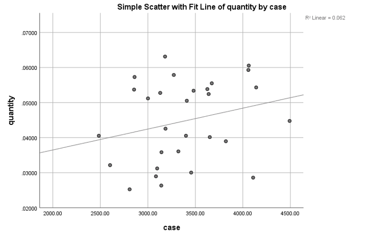
From the spatial and temperal analysis, we could understand how the COVID related tweets are distributed. Next, we want to explore the factors that influence the tweet counts. We take CA as an example. First, we think about the number of COVID cases. Considering the result is always public in the next day, we set a one-day lag and do the linear regression. t value is 0.334 and z-score is 0.193. it indicates the relationship between postive case and tweet counts is not strong.
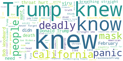
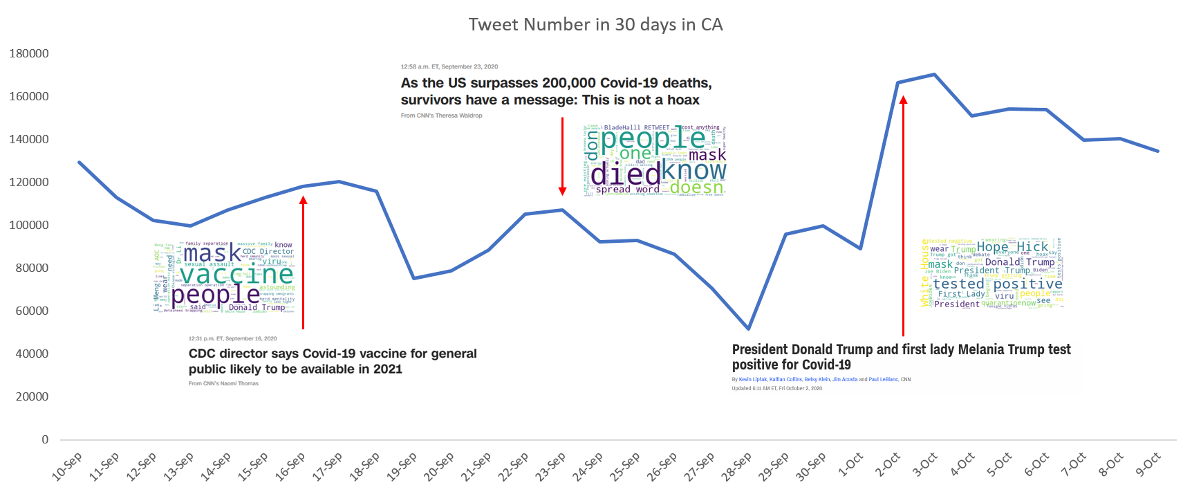
Next, we try to see whether the breaking news will influence the tweet counts. So, we make a word cloud based on the tweet content on each day. In Figure 10, we can see the trending words on each day. The size of word indicates the frequency.
Then, we find that the peak of the tweet number always correspond to big events. However, we haven't find a metric to measure the prevelance of an event. But, from Figure 11, we still can see the event can be an important factor that influences the tweet counts.
Citation
- Chen E, Lerman K, Ferrara E Tracking Social Media Discourse About the COVID-19 Pandemic: Development of a Public Coronavirus Twitter Data Set JMIR Public Health Surveillance 2020;6(2):e19273 DOI: 10.2196/19273 PMID: 32427106
Last modified November 30, 2020